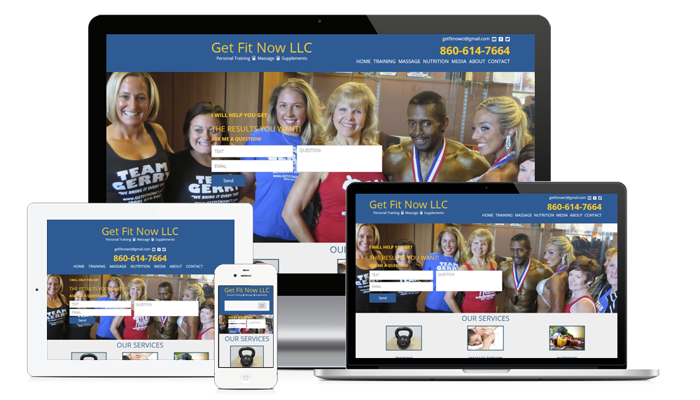
Design for conversions is a vital mindset to have when designing any new or replacement website. Your website MUST convert traffic into customers, store visits, phone calls, walk-ins, leads, email newsletter subscribers, members, social media followers, donors … whatever. It’s not a good website if it isn’t at least driving customer contacts for you.
Besides Design For Conversions, what else can website design do for you?
Some organizations can use a website to cut costs. One example is a reduction of inbound phone calls to admin staff. School websites can provide that benefit. Why answer the same question from inbound phone calls about when information can be posted on the web? This leads to design decisions that are based upon information structure and searchability.
What are the elements of Design For Conversions?
Design for conversions is primarily about having frequent, obvious and compelling calls to action. Those calls to action are typically surrounded with lots of “clickable” objects to encourage engagement and conversion. But it goes beyond that. An obvious design choice (but not always followed) is having your company’s name, address and phone number prominently displayed in the header of every page. Taking it to another level, design choices include making the phone number “clickable” so a mobile phone user can click on it and their phone will dial. We also like to use the best conversion forms and conversion tracking tools available.
Interested in improving how your website converts? Call Mediumcube today at 1-866-654-4266.
Web Design Philosophies
Website Projects Philosophies

