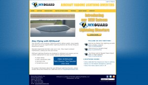
Starting this month we are going to begin showing before and after website rebuild projects. We want to illustrate the possibilities and outline the changes in contemporary rebuild website projects.

Our first “Before and After” will be a recent website rebuild we did for WXGuard and WXGuardWind. The previous WXGuard sites were outdated and not mobile friendly. They featured a slider at the top with a lot of information sliding through and a standard navigation structure for the site’s pages.
The client wanted to take the multi-page nav structure and create a “long-from scroll” site with “jump to’s” as opposed to different pages. This would allow all the relevant information to be shown on the same page and all a potential customer would have to do is scroll.

Along with easier navigation the client wanted a clean and contemporary look and feel. We had our graphic designer use WXGuard’s new logo and colors to create a contemporary “horizontal row” design that focuses on the information. She also created simple icons represent the product’s benefits easily and clearly. For the sister site of WXGuard, WXGuardWind we simply changed some colors and added in the relevant information while keeping the site structure the same.
Overall the change is a drastic improvement over the old site in both looks and ease of navigation. The website is now also fully responsive which will positively impact the site’s SEO performance and user experience. You may visit the new sites here: WXGuard.com, WXGuardWind.com


