
Since the inception of the internet the web has been a constantly changing and evolving space. Technologies improve and get faster, the web’s infrastructure grows and the design must keep up. Web design has come a long way overall and has changed dramatically in the only the last couple of years. A couple years ago the thought that the majority of web traffic would be from mobile phones seemed improbable. Fast forward to now and over 50% of traffic comes from mobile phones and Google is requiring websites to be mobile friendly or suffer the search engine consequences.
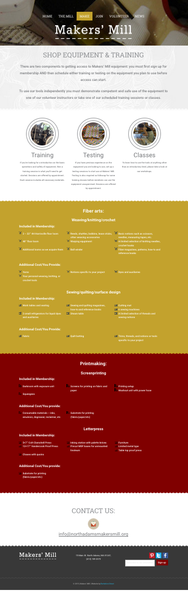
You probably have noticed that the flashy web design of the mid 2000’s has given way to flat, simple designs with very little excess. You also may have noticed that many of the top websites are using what we call “horizontal row styling”, where the information of the site is laid out in separate horizontal rows.
Many of these changes back to simplicity are driven by mobile access, phones lack the processing power of desktops and sites need to load quickly and adapt easily to the smaller platform. Simpler sites load faster and the horizontal rows allow information to stack on top of itself to be presented in a portrait style display. In addition, websites are so ubiquitous that people expect to be able to find the information they’re looking for quickly, consume it and move on without the hassle of web design that “gets in the way”. Much like the auto industry, streamlining design to improve efficiency is the path forward.
The web will continue to evolve and become more efficient and mobile phones aren’t going away any time soon, so in my opinion, the current wed design trends are here to stay for a while. If you’re looking to update your website’s design, call us at 413-458-1721, we’d be happy to help you!